

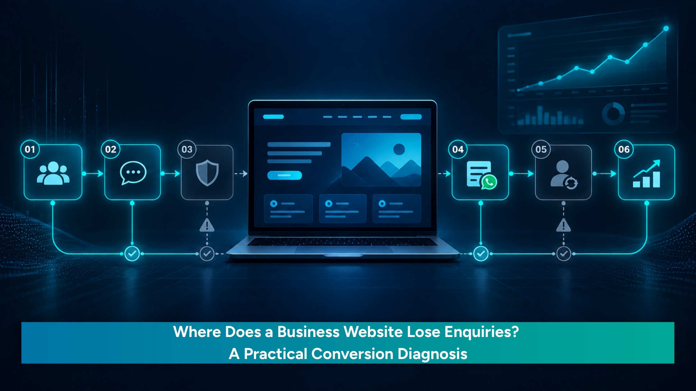
A business website can receive visitors and still produce very few enquiries. That does not automatically mean it needs more traffic or a complete redesign. Low enquiry volume can come from wrong traffic, poor relevance, weak trust, an unclear call to action (CTA) or a form that asks too much.
Website conversion is a journey, not a single button. The right visitor needs to recognise the offer, trust the business and find a manageable next step. This diagnosis is for founder-led service businesses, consultants, local businesses, small manufacturers and growing companies that receive visits but inconsistent enquiries. It helps locate the first break and choose a focused improvement instead of guessing.
Table of Contents
Is the Problem Traffic or Website Conversion?
Separate the problem into two possibilities.
- Not enough relevant traffic. Few suitable people may be reaching the right page because search intent, campaign audience, geography or source quality is wrong. The landing page may also break the promise made in the search result, advert or social post. When discovery is the issue, start with a search-visibility and targeting review; the SEO, AEO and GEO services page outlines that work
- Relevant traffic arrives but does not act. If suitable visitors reach the service page but CTA clicks, form starts or qualified enquiries remain weak, investigate the conversion path. Check whether the page confirms relevance, reduces risk, clarifies the next step and works on the visitor’s device.
Contentsquare’s 2025 Digital Experience Benchmarks analysed more than 90 billion sessions across 6,000 websites and reported a 6.1% year-on-year fall in conversion rates as digital advertising spend increased by 13.2%. It is a broad benchmark, not a small-business forecast, but it supports examining what happens after traffic arrives.
Why Do Website Visitors Leave Without Enquiring?
Most website leaks appear in five connected areas.
Relevance is unclear before the visitor scrolls. The first screen should answer: What does this business provide? Is it relevant to my situation? What outcome can it support? Can it serve my location or requirement? A manufacturer page that says only “complete engineering solutions” does not tell a visitor whether the company handles the exact component, material or production need. The headline, audience cue and differentiator should make the fit clear quickly.
The page does not provide enough proof to reduce risk. Proof is evidence that supports a decision: case studies, testimonials, reviews, credentials or portfolio examples. Supporting information, such as capability details and process clarity, helps the visitor understand how the service works. Both matter, but they do different jobs. Place them near the claim they support. In one of our website projects for LugarOne, the challenge was not simply visual redesign. The business needed its services, credibility and enquiry path to be easier to understand, so the work focused on clearer presentation, stronger trust cues and a more visible path to enquiry. See the LugarOne website project. This was a project-specific outcome and should be read in that context.
The CTA does not match visitor readiness. Someone comparing providers may be ready to discuss a requirement, while another visitor may have one practical question. “Discuss Your Requirement” may suit a first-stage visitor better than “Book a Consultation” in some contexts. Use one clear primary action and, where needed, one lower-commitment option. Review wording, placement and clicks by page, device and source.
Mobile usability creates friction. Test the menu, button visibility, tap targets, pop-ups, sticky CTA, page speed and WhatsApp or phone links on the devices visitors actually use. A responsive layout can still be awkward to navigate. Unbounce’s 2024 benchmark found that 83% of sampled landing-page visits came from mobile devices, while desktop pages converted 8% better than mobile pages. Use this as context, then compare the business’s own device-level behaviour.
The form asks for too much commitment. The first form should collect enough information to understand the requirement—not force the visitor to complete the sales discovery process. Separate form views, starts, errors and submissions. If people start but do not finish, inspect mandatory fields, validation messages, privacy reassurance and mobile completion. Also check message match: an advert promising one service should not send visitors to a broad homepage where they have to search again.
Diagnose the First Broken Stage
Use the signal that is easiest to observe to decide what to test first.
- Few relevant visitors: Review search intent, targeting, geography and source quality.
- Relevant visits but few CTA clicks: Review the first-screen message, CTA wording and placement.
- Good page engagement but few form starts: Check whether the next step is clear and proportionate.
- Many form starts but few submissions: Inspect field requirements, errors, privacy language and mobile usability.
- Desktop actions are much stronger than mobile actions: Test mobile layout, speed, tap targets and form behaviour.
- Good clicks but poor enquiry quality: Review the audience, offer and message match.
Key takeaway: Reach → Relevance → Trust → Action → Capture
Start with business actions: relevant visits, CTA clicks, WhatsApp or phone clicks, form starts, form errors, submissions and qualified enquiries. Then use GA4 and Google Tag Manager to track the relevant events, with behavioural tools where more context is needed. The purpose is not to collect every metric; it is to connect each signal to a decision about what to improve next.
What Should You Fix Before You Redesign?
Optimise first when the structure is usable. Redesign when the structure or technology prevents meaningful improvement.
For example, a small manufacturer may receive relevant visits, but its page headline says only “complete engineering solutions”. The first test could be a specific capability statement, one requirement-focused CTA and a shorter initial form. Compare CTA clicks, form starts, submissions and qualified enquiries over a meaningful comparison period before deciding whether a wider rebuild is necessary.
Optimise the existing website when the architecture works but the evidence points to unclear messaging, weak proof, poor CTA placement, mobile friction, form problems or incomplete tracking. Consider a redesign when navigation, page hierarchy, responsiveness or the underlying technology prevents the required improvement. A conversion-focused website project may be appropriate when those structural limits prevent meaningful change. A redesign should follow a diagnosis, not replace one.
Once a form is submitted, acknowledgement, ownership, follow-up and outcome tracking need a separate review; they are part of the complete enquiry journey but sit beyond this website-side diagnosis.
Fix the First Leak Before Adding More Traffic
A website conversion problem is rarely solved by more traffic alone. First identify whether the break is in reach, relevance, trust, action or capture. Then test the smallest change that addresses the evidence: improve the audience match, clarify the first screen, add relevant proof, adjust the CTA, remove form friction or repair the mobile journey. If the site’s structure is sound, targeted optimisation may be enough. If the structure or technology blocks meaningful improvement, a conversion-focused website project may be the better next step.
Need to understand where your
website is losing enquiries?